New York has hundreds of courthouses across the state, with court business largely conducted in person pre-pandemic.
When the pandemic hit and courts were forced to work remotely, it highlighted the need for an updated website and online court services.
Access to justice and a fair, impartial, and accessible legal system for all is a key principal of our justice system. However, the majority of the civil or criminal litigants are people of color, in high-volume courts with fewer resources. The effect is a second-class system of justice for people of color in New York State.
Design a user-centered, responsive court site with online services to increase access to justice and reduce the need for in-person visits.
Research, UX, UI
Figma, Miro, Otter, Flowmapp, Gloomaps
6 weeks
Self-Guided project with feedback from mentor + peers
.svg)
There were many relevant reports and articles, so I took a week to read, recruit for interviews and create a research plan.


The Access to Justice Gap is the difference between the civil legal needs of low-income Americans and resources to meet those needs.
Without legal assistance, individuals can struggle to navigate complex court procedures. Yet, the high cost representation means 80% of low income individuals cannot afford to hire an attorney. Very few people qualify for free legal aid, and instead must self represent. They are in high-volume, crowded courts like Bronx Housing Court.
.jpg)
A long line of tenants wait to enter Bronx housing court in 2015. [Photo: Adi Talwar]
I defined my Provisional Personas based on my Market Research. I was focusing on interviewing self-representing litigants and attorneys who represented them, as these are the people most affected by the access to justice gap.

What I did to respect their comfort level was be transparent with how I was going to use the information, ensure confidentiality, and offer to let them review my notes after and remove anything they did not want me to use. It didn’t come to that, but it helped build trust.
See Interview Script
Ideally I would have stood outside a courthouse to recruit, but with NYC at a high alert for Covid, I recruited online. I emailed non-profit organizations, friends and found users through Craigslist.


Collective Experience: Civil, Family & Criminal Court
In order to review my research findings I created an Empathy Map to look for patterns and insights.


People would often spend all day in court waiting for a 15 min. case to be called

Litigants spoke about feeling judged and looked down on in the courts. They want to be seen as a person and have their stories heard.
I created my User Persona to summarize my research findings, including the goals and the needs of the target user.
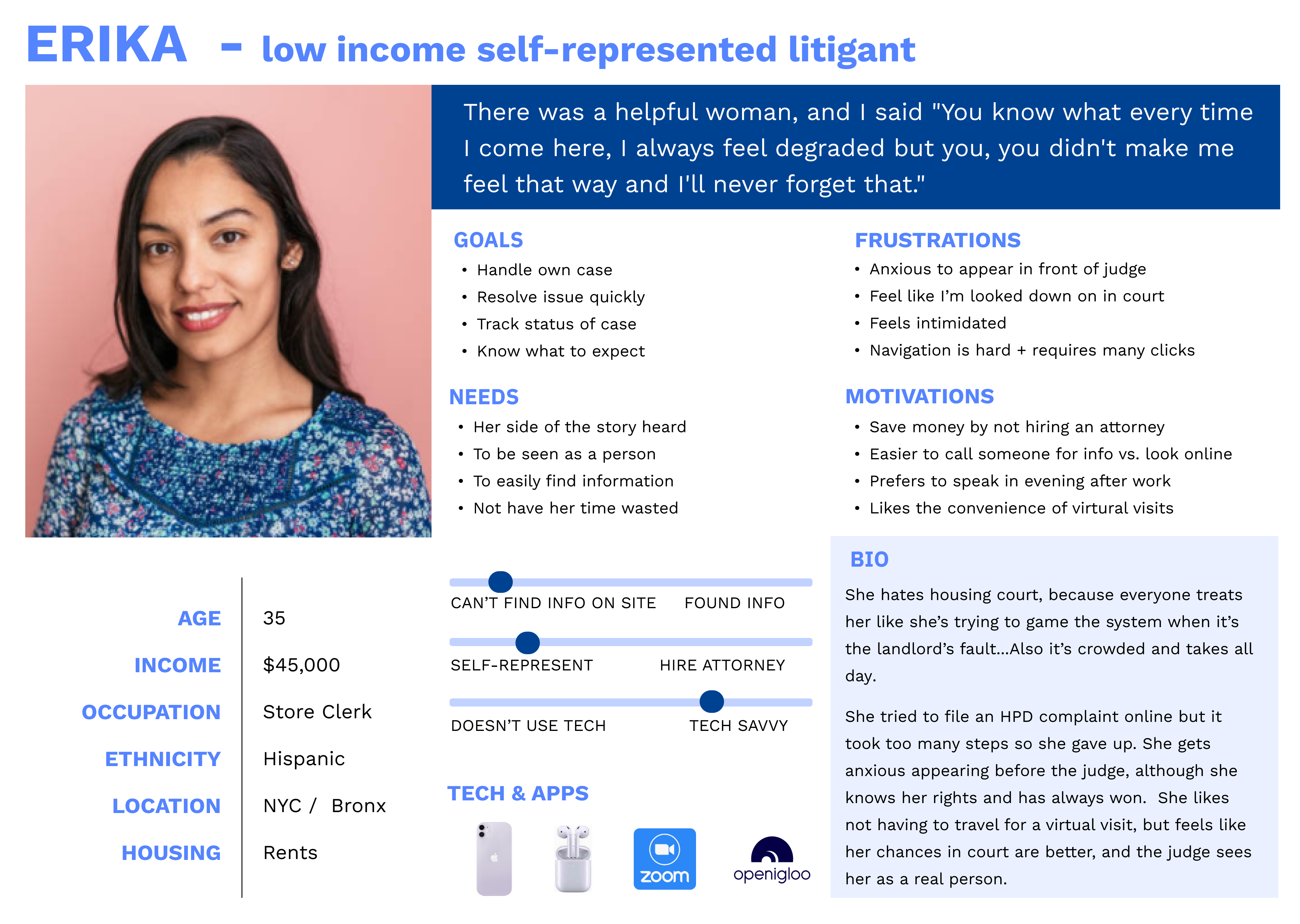

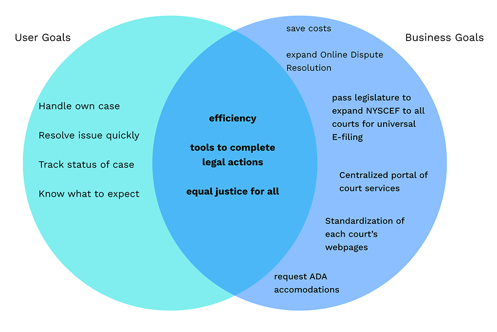
I identified user goals from my interviews, and read about the Organization Goals from the Administration reports and press releases.
I used a mind-mapping technique to come up with as many ideas as possible. I also used ‘Worst Possible Idea’ where I was stuck on the harder questions to help me generate ideas. I also had a brainstorming discussion with a friend from Housing Court about pre-trial conferences to understand what part of the process I could re-create online, and this led to the idea for Online Dispute Resolution.
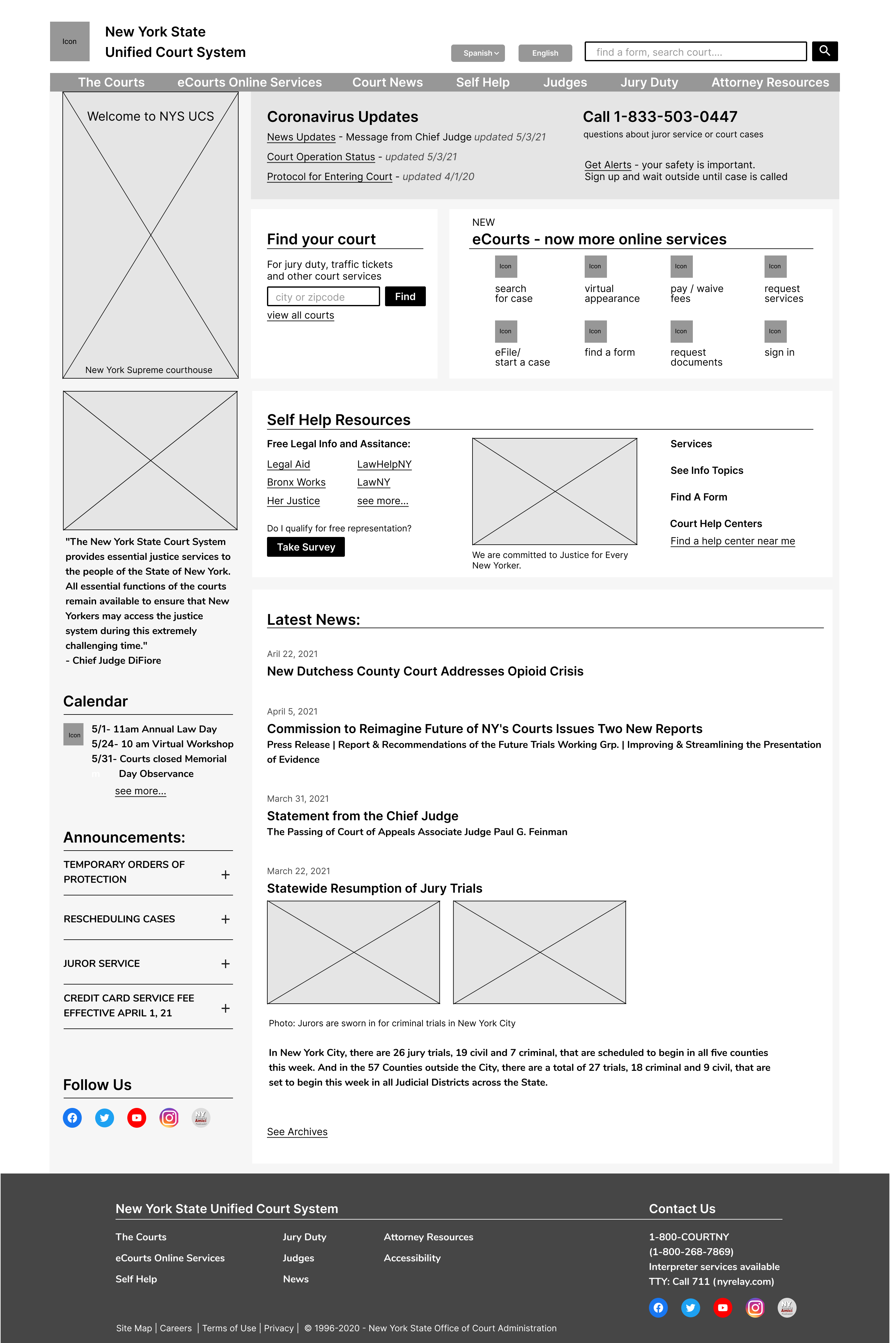
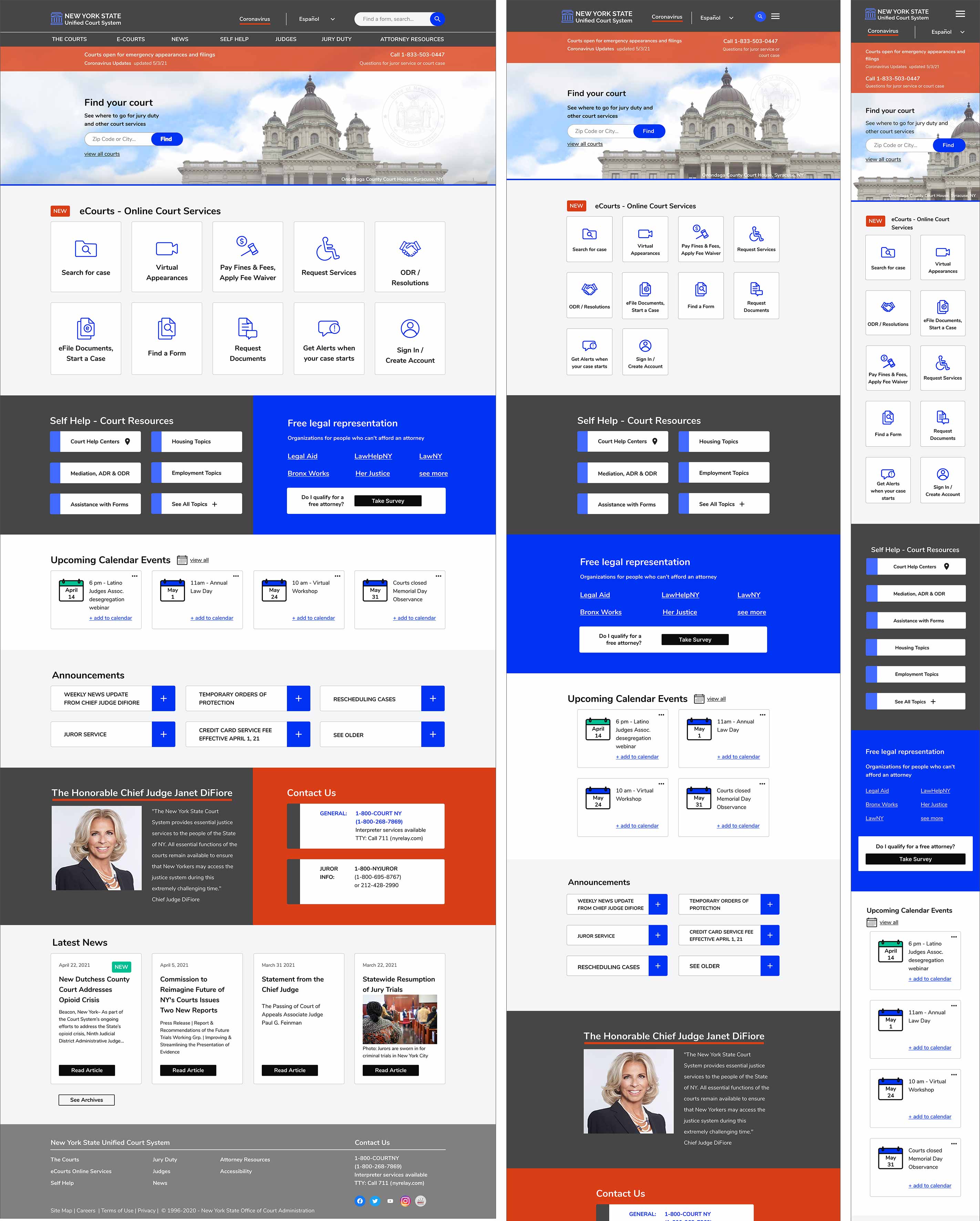
My goal was to have users see the most important info on the landing page and navigate to their dashboard to start or manage cases.
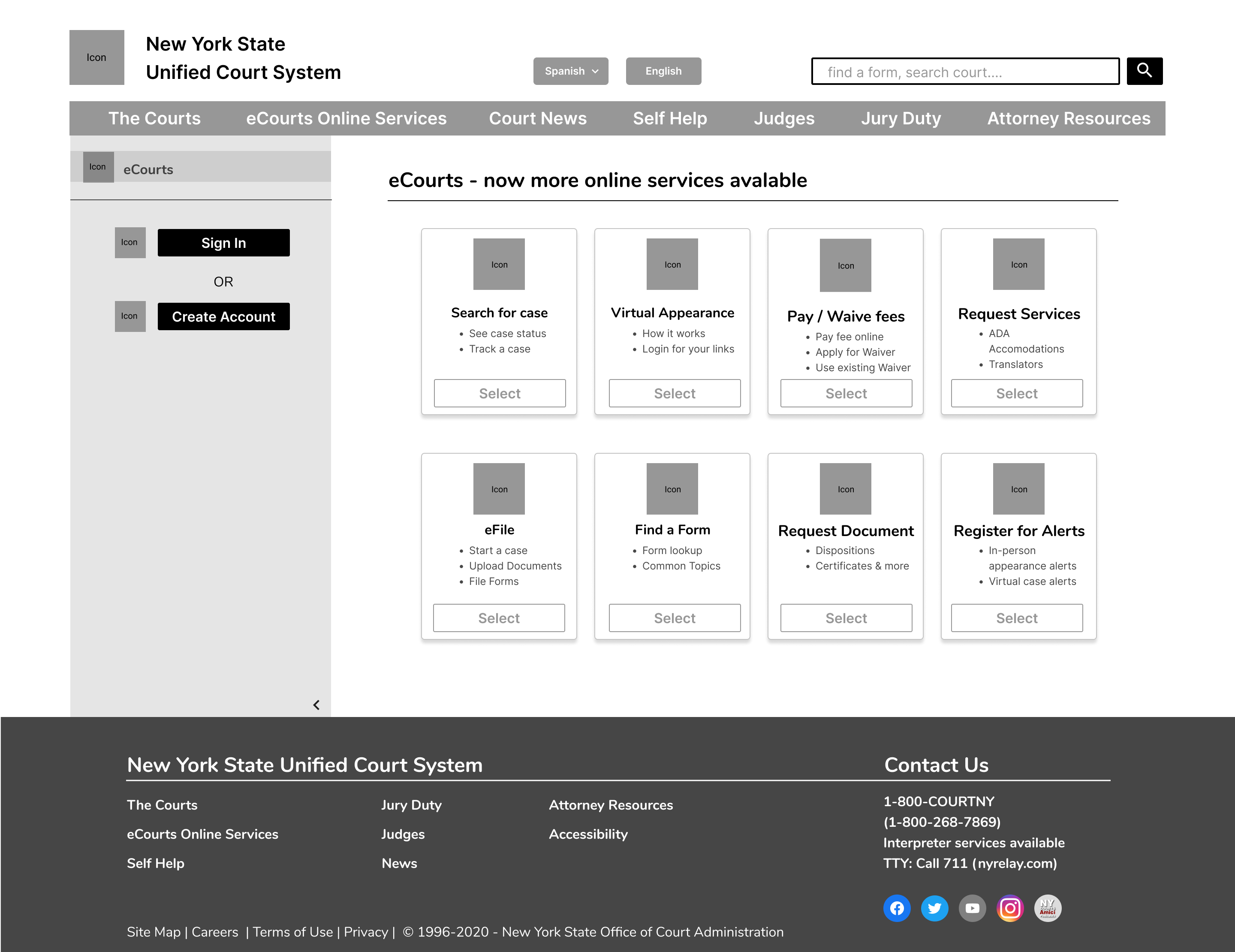
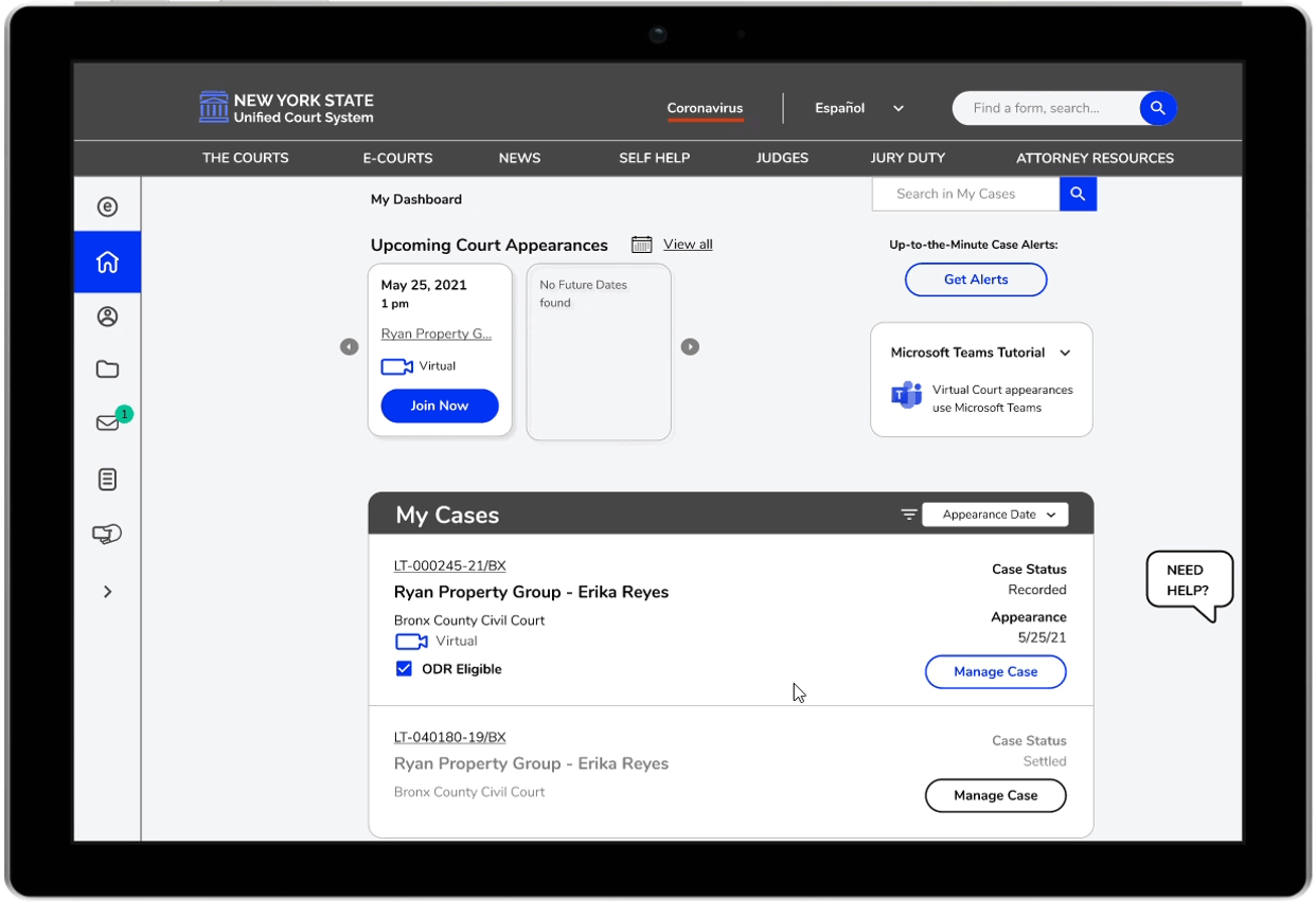
I was also excited to build an Online Dispute Resolution feature for Housing court that would allow landlords and tenants to come to an agreement digitally. This would increase efficiency for litigants and the courts.
A development team was not going to be able to implement everything at once. To manage the work I prioritized the must-have features for an MVP, and categorized the effort to execute them.
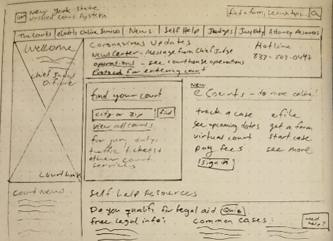
I noticed most attorneys who used the site did a google search to find the page they were looking for, rather than navigate from the home page. Self-representing users managed to track their cases, but forget finding answers to other questions. So it was clear the Information Architecture was due for an update. I created a framework for the pages, and where information would go in the future.
.png)
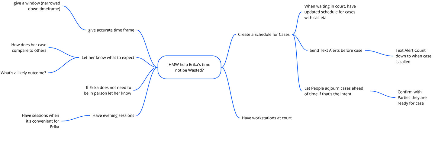
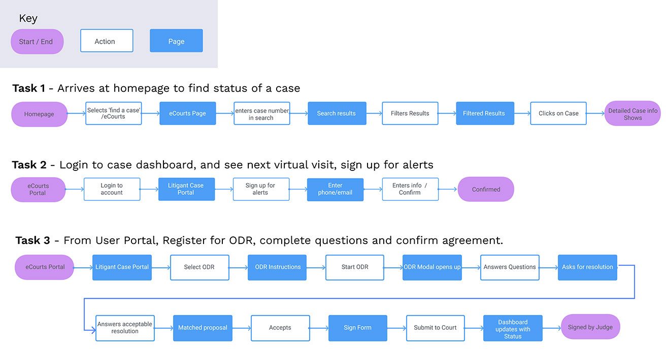
The key tasks users needed to accomplish were identified and task flows were created to begin to visualize the steps and get it down onto paper. Each step built on the next, as I went into more and more detail and began sketching each screen necessary to complete the tasks.
I focused this large project by creating task flows for users to achieve their goals. I created user flows to further empathize how people would use the site.
I created my UI Requirements to organize what information users would need on each page before sketching.
I addressed Erika’s need to find information with less clicks by adding buttons and links for functions users needed most to the homepage. I also thought about how experienced users, like attorneys, should be able to login from the home page easily.

Screens were created for a user to complete each task flow in a prototype.
By testing on a Mid-Fi Prototype I could get feedback on the navigation and content of the homepage and dashboard faster than if I waited until the Hi-Fi Prototype was ready. And quick feedback would help me with my layouts which I wanted to polish further.
.png)
Completion rate (the average percentage of tasks the user was able to complete):
.svg)
Error Free rate (the percentage of tasks completed without errors or confusions):

Task- You have a case in housing court, find your case status
Completion Rate= 40%
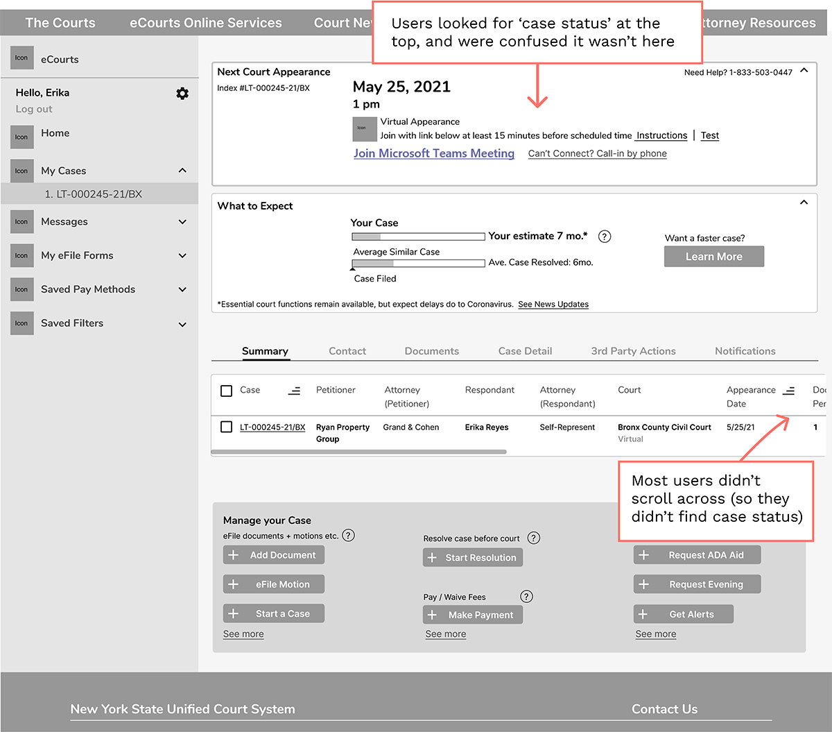
Users expect to see most important items at top of Dashboard
Dashboard needs better visual hierarchy so people see most important info here and less distractions.
Task - Find your next Court appearance Date
Completion Rate= 100%
*Since this info was at the top of the dashboard users found it easily.
Users also noticed it was a virtual hearing, which was excellent.
.png)
Task - Register for ODR, complete questions and confirm agreement. You can't pay your rent and your landlord is taking you to court to get it.
Completion Rate= 100%
Users completed the task but had some questions along the way, so there's opportunity to make the process smoother.
The interface was in need of an update, as users found it to be old looking and the colors unappealing. A new look would give users more confidence in the site and make it more pleasant to use. I defined the brand attributes as MODERN, BOLD, APPROACHABLE, FAIR, JUSTICE.
I created mood boards for Color, Typography and Logo inspiration with images fitting these attributes.
I built a reference of the brand style for myself and future stakeholders that could be updated as more components were added in the future.
.png)
Users found the dashboard confusing and were having information overload. I looked at sites for layout and design pattern ideas, and re-worked my dashboard to feature the most essential information
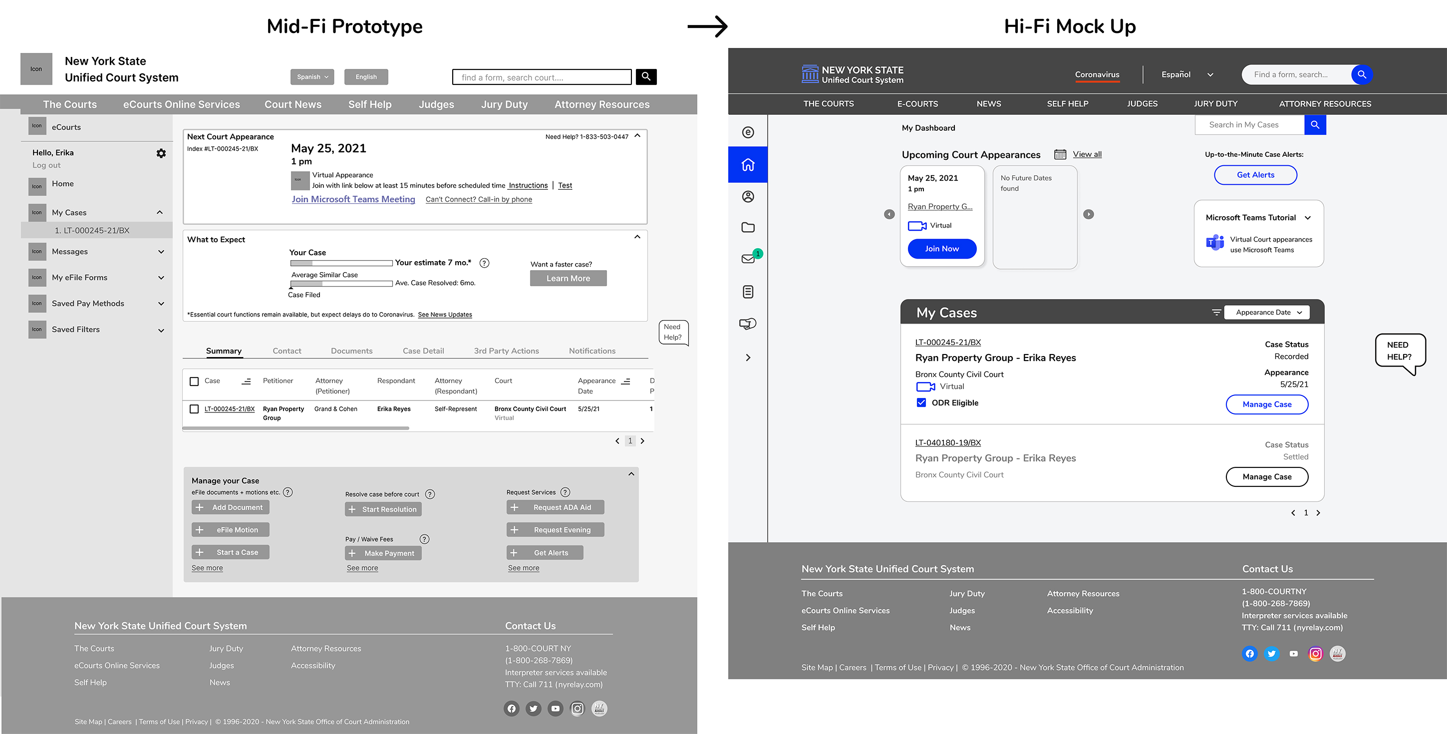
Usability test recommendations are incorporated into the Hi-Fi Mock Up
.jpg)
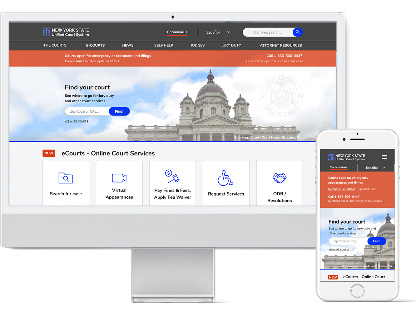
The original website was hard to find information on and it looked outdated. Now the page has a modern look and is easy to navigate.
Ensures viewability on any device
.jpg)
Most court users and attorneys I interviewed used this function. Previously, it took four clicks (and guessing the correct menu to look under and correct court database). Here the databases are combined so the user enters the # and the database does the work.

There is no centralized online process for filing case documents. This digitizes the process so it can be accessed remotely.
This benefits self-represented users who don't qualify for free representation but can't afford an attorney, and are comfortable using the computer.
Some of the court users I interviewed had been to court several times for the same issue and knew what to do. They would be able to resolve their case online if it was an option.
By digitizing uncontested resolutions, it frees up the courts' time for other matters. See ODR
I addressed important needs of the user to easily find information, and the organization to improve efficiency. A usable site benefits everyone, but especially minority self-representing users by saving them time so they can access the courts with less disruption to their lives.
.png)
