Hoboken is referred to as the ‘Mile Square City’ because it takes up a little over a mile square directly across from NYC on the Hudson River. Hoboken has a dense population of 53,000, and a small, precious amount of open space and parks.
Being a resident myself, I wanted to create a civic engagement app that would benefit the city and residents.
UX Research, Strategy & Design, UI
Figma, Figjam, Miro, Zoom, Otter
6 weeks

There are great sports programs in town and athletic facilities to use, but sometimes residents miss out because they are not aware of them or times they are available. When Residents can’t find the info online, they turn to social media, word of mouth, or contact city hall in person or thru email.

Define and Design an MVP app for residents to easily get info on the topics they are interested in, get reminders for events and find answers to their questions.
.svg)
With these insights from City Hall stakeholders I was able to outline a project brief and create a research plan.
I learned about the demographics of Hoboken, and city programs and events so I would know who to interview and be familiar with services. See full Market Research Report.
.svg)
.svg)
.svg)
I spoke to residents at parks and City Hall (which had just re-opened by appointment only due to Covid) and recruited on social media, and interviewed 10 residents total. See Interview Guide
The people I spoke to used different services from the city, so an empathy map helped me to uncover patterns and see similarities in residents' challenges. See full empathy map findings.
.jpg)
People are not aware of City services and instead discover information through:

Residents miss out on joining events, organizations, and leagues when they miss emails or getting information took too many steps.

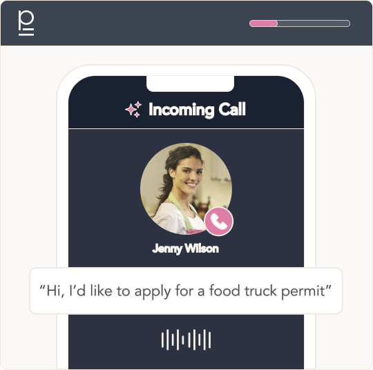
Residents get frustrated when they can’t reach people by phone or email. People used to be able to walk into City Hall for assistance, but that’s not an option with everything being remote.
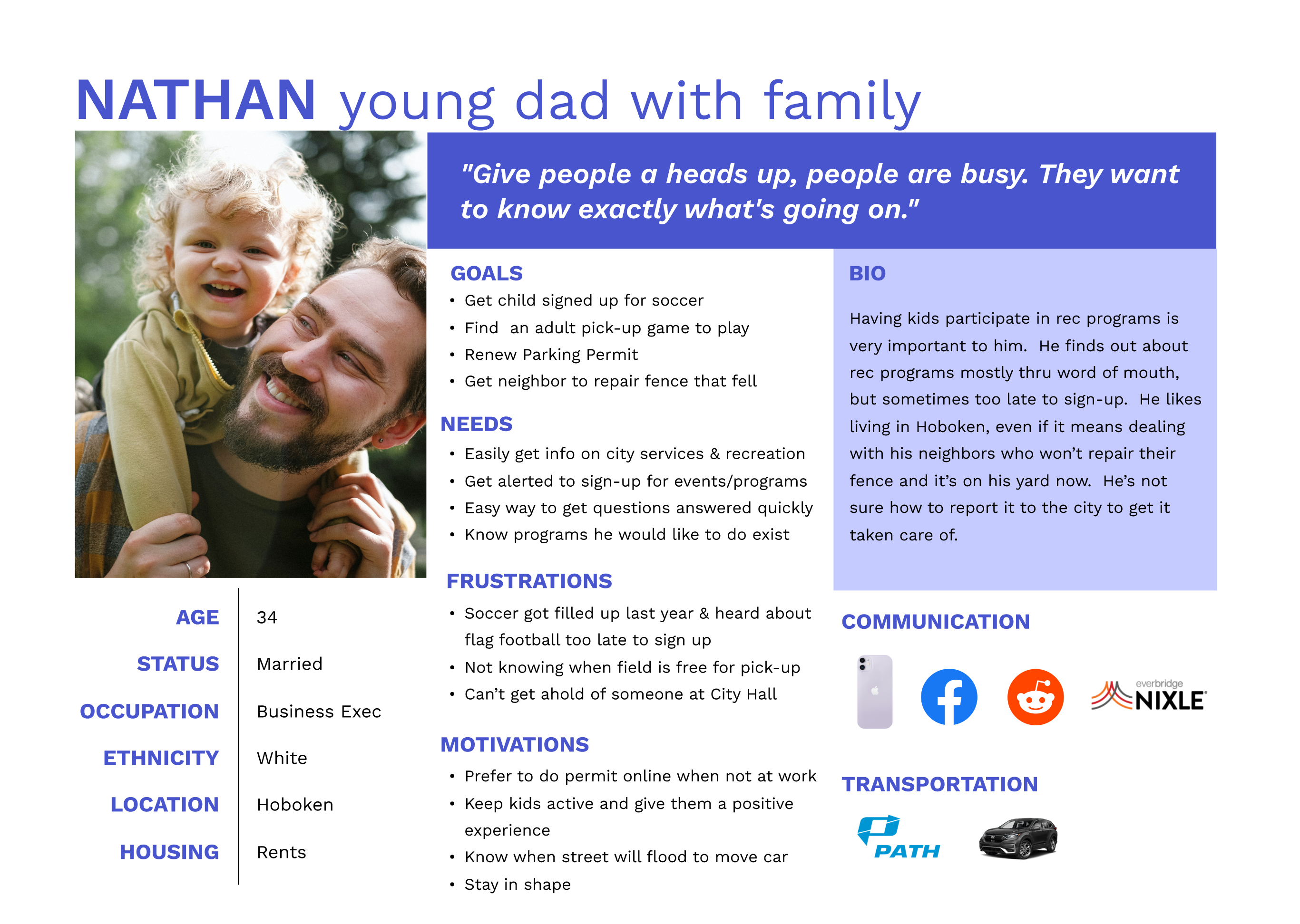
I summarized my findings with a user persona to help me focus on the perspective of the residents and their needs

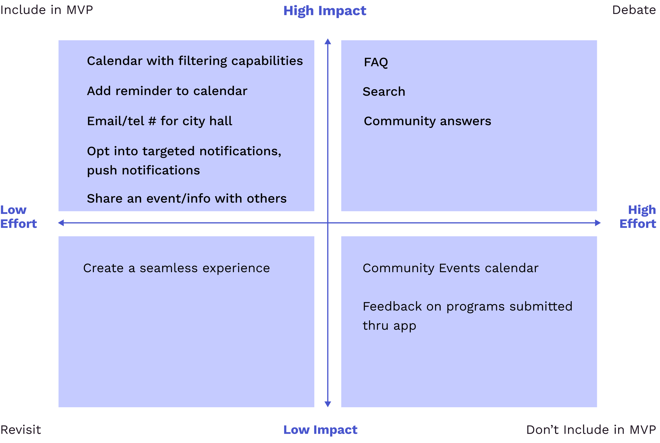
It was important to define an MVP for the app because I had time constraints and had to prioritize what to build first. While there were multiple departments in City Hall that would benefit from the app, the Recreation Department was a priority of the administration.
I examined shared goals between users and the administration to see what would have the most impact.

This helped me further empathize with the users and find areas of opportunity on their path, and it was a brief summary to share with stakeholders as well.
.png)
I addressed the opportunities with 'HOW MIGHT WE' statements
I determined the priority of each feature and what should be included in the MVP by identifying the High Impact features, and what could be done in later launches (lower impact & higher effort)
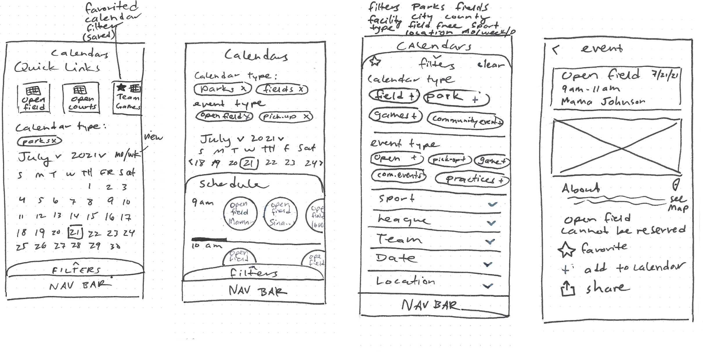
I laid out the AI sitemap for the app, created task and user flows, and began sketching before jumping into wireframes.
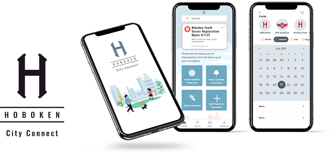
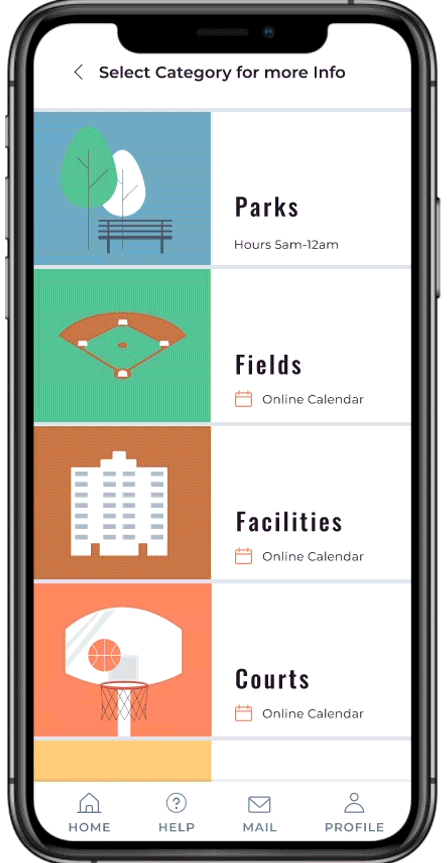
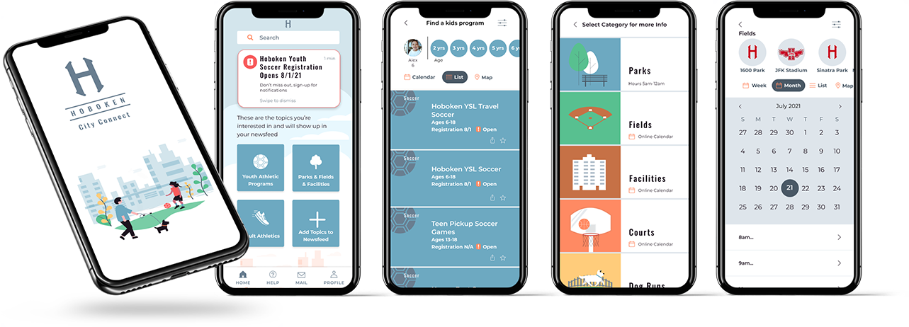
The app needed to include a field schedule to see when the fields were free to use. I also knew from speaking with parents they typically receive a pdf schedule of games, so I included filtering by teams so they could view the schedules online as well.
To increase awareness for programs and services, I sketched how Residents could select their interests and customize their newsfeed with targeted updates.
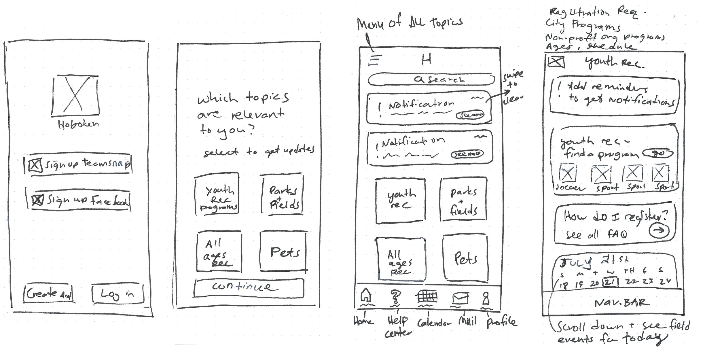
A comprehensive list of youth athletic programs offered by the city and other reputable local organizations would create the one-stop resource residents needed. Signing up for notifications gives users timely reminders to their phone where they will see it.

Screens were created for a user to complete each task flow in a prototype.

Completion rate (the average percentage of tasks the user was able to complete):

Error Free rate (the percentage of tasks completed without errors or confusions):

*There were some tasks users had confusion with that needed to be changed. See all test results and prioritization of revisions
Completion Rate: 0%
6 Mistakes 1 Slip
No users found the schedule on their own.
.svg)
.svg)
.svg)
I also included ‘Map’ view here, which was prevously a screen deeper. But location was important to users so should be a more prominent option.
They didn’t all take the path I prototyped (filter by open field), they clicked on location or time first. But I learned:

.svg)

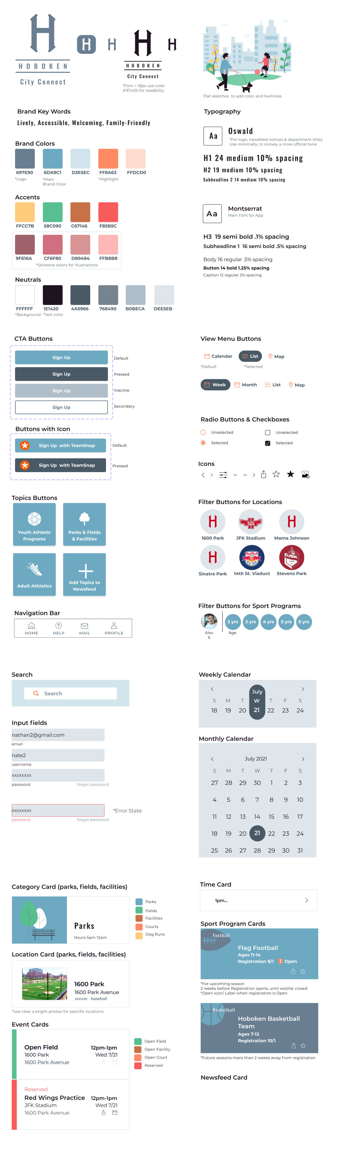
I put together a UI kit of components and cards as a reference and a library to be reused and added to as the app grew. See full UI Kit.
I was ready to create hi-fi prototypes.
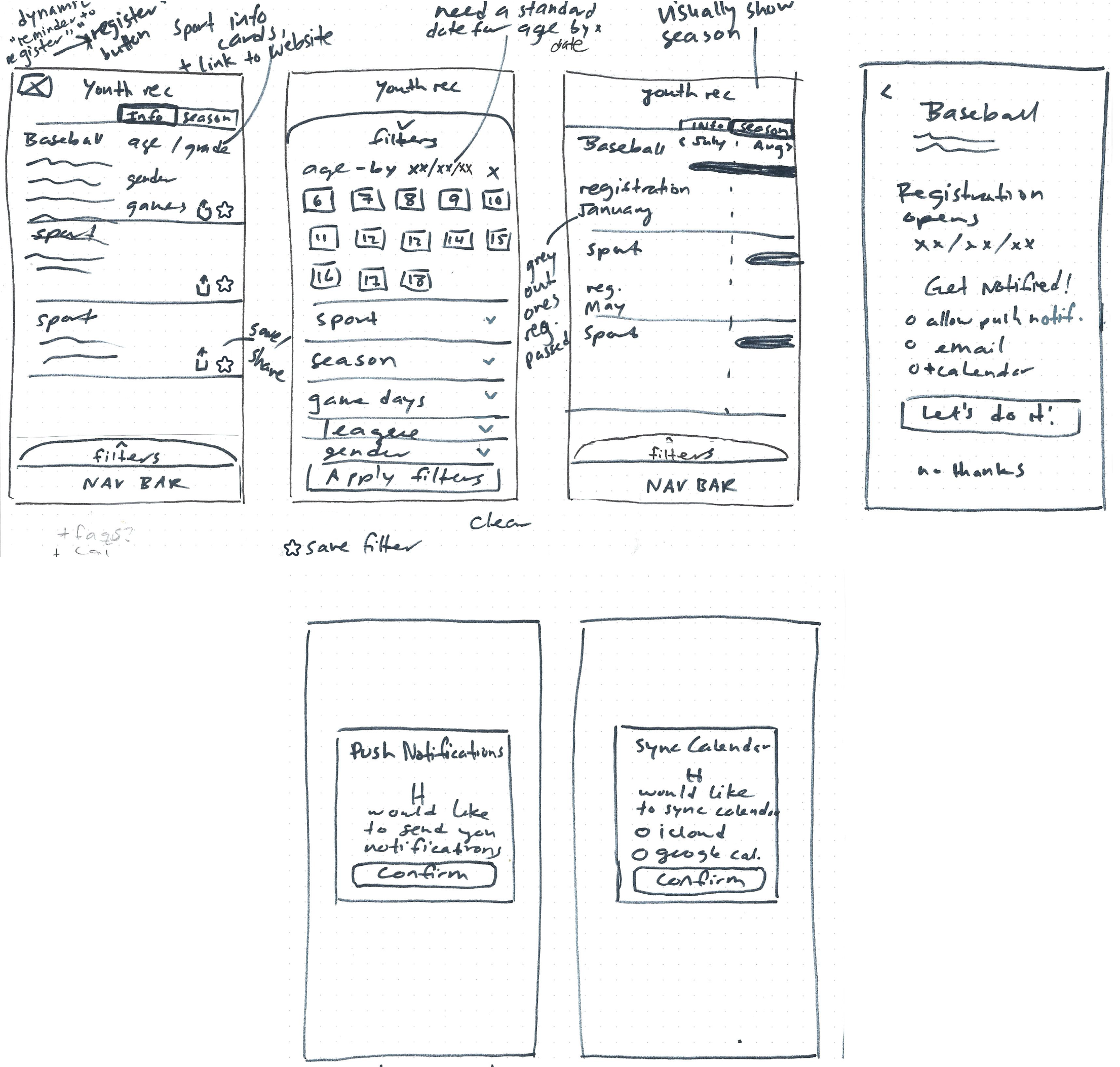
Signing in with Teamsnap let users import profiles & paperwork from the current app city is using for registration. The registration process could be added to the Hoboken app in the future.
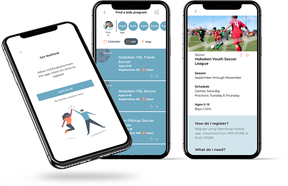
Missing out on registration is a pain point. Users are busy and this helps them plan ahead for sign-up.
Residents need this information, and by making it more accessible it will reduce calls and walk-ins to City Officials.
The app still gives residents a way to contact the city if more info is needed.
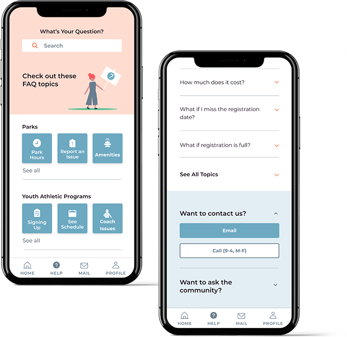
This information is not currently available to residents. Having visibility to the schedules will save residents time and frustration, and reduce the amount of time the recreation department spends answering questions
.svg)
We addressed the city’s goals of improving communication with residents and the residents needs for information, learning about programs and services and contacting city hall for assistance.


.svg)